Numerous website reviews reveal that color contrast is a common issue. Shockingly, 81.0% of homepages had low-contrast text, according to the WebAIM Million project, which examines the homepages of the top one million websites and identifies the most common accessibility issues. This is where Guideline 1.4, Distinguishable, steps in. It aims to make content visually distinguishable and accessible for all users to perceive. For instance, it’s essential to ensure that text has a high enough contrast ratio with its background and avoid using color as the only way of conveying crucial information. By doing so, all users can interact with the content in a way that suits their needs.
Understanding Success Criteria (SC) Levels
Understanding this guideline requires familiarity with WCAG’s three success criteria levels: A, AA, and AAA.
- Level A is the most basic accessibility feature and should be included in all web content.
- Level AA, which deals with the most significant and common barriers, is required by law in the United States.
- Level AAA is the highest standard and can be more complex to achieve.
While most organizations in the United States aim for Level A and AA to meet legal and practical requirements, taking into account Level AAA guidelines can help make content even more accessible, resulting in a more inclusive user experience.
SC for Distinguishable
Guideline 1.4 features several success criteria at various levels, each enhancing accessibility to different extents.” Within Guideline 1.4, there are four criteria at the highest Level AAA. However, our focus will primarily be on fulfilling the requirements of Levels A and AA, which are more commonly targeted and enforced by regulations.
- Level A
- 1.4.1 Use of Color
- 1.4.2 Audio Control
- Level AA
- 1.4.3 Contrast (Minimum)
- 1.4.4 Resize Text
- 1.4.5 Images of Text
- 1.4.10 Reflow
- 1.4.11 Non-text Contrast
- 1.4.12 Text Spacing
- 1.4.13 Content on Hover or Focus
- Level AAA
- 1.4.6 Contrast (Enhanced)
- 1.4.7 Low or No Background Audio
- 1.4.8 Visual Presentation
- 1.4.9 Images of Text (No Exception)
Level A
1.4.1 Use of Color
Color should never be the only way to convey important information. Instead, web designers and developers should use a combination of shape, text, and color to convey information. This approach ensures that users with color blindness or other visual impairments are not excluded from accessing important information on a website.
Required Input Example
Imagine you’re managing a website dedicated to tiny house living. The site features a section where visitors can sign up for a monthly newsletter. The form requires users to enter their email addresses, and you want to ensure it’s accessible to everyone. To clarify this, required fields are marked visually with an asterisk * (Required) and include an aria-required=”true” for screen readers to ensure the requirement is clear to all users. Check out WebAIM’s guide on adding a required field for more detailed approaches.
<label for="email">Your email: * (Required)</label>
<input type="text" id="email" aria-required="true" />
1.4.2 Audio Control
Ensure web pages provide controls to stop, pause, or adjust the volume of audio playing longer than three seconds. This ensures that users who may have difficulty perceiving or processing audio content or want to control their audio experience can do so.
Video Example
Imagine you manage a fan page dedicated to The Ohio State University football team. The page features dynamic content such as game highlights and other media. Accessible websites effectively manage audio content delivery. One straightforward way to comply with this SC is to avoid using the autoplay attribute for audio and video elements. For example, instead of <video controls autoplay> or <audio controls autoplay>, use:
<video controls>
    <source src="osu-game-highlights.mp4" type="video/mp4">
    Your browser does not support the video tag.
</video>
Level AA
1.4.3 Contrast (Minimum)
Maintain a contrast ratio of at least 4.5:1 for text and images of text. The exception to this contrast ratio is for large-scale text (font size of at least 24 pixels or 18 pixels if bold), logos, inactive buttons, and purely decorative images. This requirement ensures that people with visual impairments or color deficiencies can easily read and understand the content on a website or application.
Health Clinic Example
Imagine you are designing a website for a health clinic that caters to a large demographic, including elderly users who are more likely to have vision impairments. The website’s original design features main content text in light grey (#CCC) on a white (#FFF) background, such as operating hours and contact information. This color combination only provides a contrast ratio of 1.6:1, significantly lower than the WCAG minimum requirements. Tools like the WebAIM Contrast Checker can be used to verify these ratios during the design process to ensure compliance.

1.4.4 Resize Text
Ensure that text remains clear and functional when resized up to 200%. Exceptions to this include captions and images of text. It is particularly beneficial for users with visual impairments such as low vision or presbyopia, enabling them to increase text size to improve readability comfortably.
Serenity Massage Example
Imagine you are developing a website for Serenity Massage, which offers various massage services detailed alongside pricing information. The target audience includes adults of various ages, including those with presbyopia, a common condition where close-up vision gradually blurs. To ensure that website content remains legible and functional when text size is increased, it is crucial to employ responsive design principles:
/* Sets the standard for calculating rem units */
html {
  font-size: 16px;
}

/* 16px  */
body {
  font-size: 1rem;
}
1.4.5 Images of Text
Use actual text rather than images of text unless for branding, official documents, or artistic purposes. This ensures text remains accessible, resizable, and legible with assistive technologies. When text is unavoidably used in images, provide a descriptive alt attribute to ensure the content is accessible to visually impaired users. Check out Images of Text from WAI Web Accessibility Tutorials for more in-depth examples.
1.4.10 Reflow
Ensure content is zoomable up to 400% without horizontal scrolling or loss of content and functionality to accommodate low-vision users. Reflow allows users to read content in a single column, which is very useful for those who use magnification tools. However, there are some exceptions to this rule. For example, in non-linear or interactive content, or where changing the layout would alter the fundamental meaning or functionality, the content cannot be reflowed.
Layout Example
To ensure that the content reflows appropriately, it is recommended to use flexible layouts, such as Flexbox and Grid systems, which are designed to adapt to different screen sizes without causing an overflow. Additionally, media queries should be used for different screen sizes and orientations, ensuring that the content reflows into a single column or more appropriate layout at larger zoom levels.
1.4.11 Non-Text Contrast
Ensure all non-text elements on web pages, including UI components and graphical objects, have a contrast ratio of at least 3:1 against their background. Ensuring this contrast level is vital for users with low vision or color vision deficiencies, as it allows them to distinguish and interact with these elements more effectively, enhancing usability and accessibility.
Button Example
Consider the contrast requirements for a button on a web page. You must ensure the button’s background has at least a 3:1 contrast ratio against the page background in all visual states—default, hover, and focus. Use tools like a color contrast checker to verify that your color choices meet these standards. For those interested in expanding their knowledge of accessibility and design, consider exploring further educational resources such as Liz Brown’s course on Udemy, ‘How To Design for Accessibility: for UX Designers (WCAG 2.2).’ This course offers insights into broader accessibility principles, including detailed discussions on color contrast for non-text elements.
1.4.12 Text Spacing
Enhance text readability by ensuring text spacing is adjustable. Users should be able to modify character, word, and line spacing to improve legibility.Developers should allow users to adjust the spacing between characters, words, and lines for better readability. This can be done by:
- Line height (line spacing) to at least 1.5 times the font size.
- Spacing following paragraphs to at least 2 times the font size.
- Letter spacing (tracking) to at least 0.12 times the font size.
- Word spacing to at least 0.16 times the font size.
1.4.13 Content on Hover or Focus
Guarantee accessibility of content triggered by mouse hover or keyboard focus. Such content must meet several conditions:
- Persistent: It should stay visible as long as the user hovers or focuses on the triggering element or the additional content and must not disappear unexpectedly.
- Dismissible: Users must be able to dismiss the content easily without moving their mouse or focus unless they deactivate it by moving away or shifting focus.
- Hoverable: If moving the mouse to the content is required, it must be possible to hover over this content without it disappearing.
This SC does not apply to user agent-controlled content, such as tooltips generated by the HTML title attribute, which are less interactive and typically handled by browsers.
Good Example
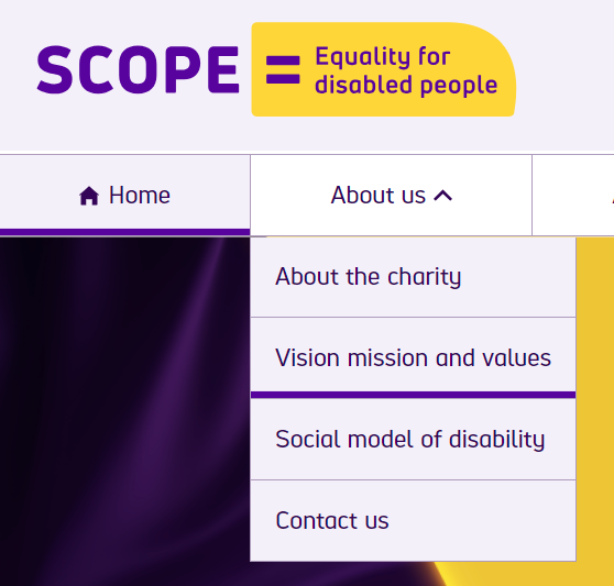
An excellent example of a website that implements this SC can be found on Scope’s website, a disability equality charity in England and Wales. Their navigation menu is outstanding because they meet the following criteria:
- The dropdown menus are focusable and remain visible if the user interacts with them using a keyboard or mouse.
- The dropdown menus can be easily closed by pressing the ‘escape’ key on the keyboard.

Bad Example
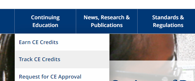
I came across a website with a navigation menu with some common oversights. The dropdown menus on the site can only be accessed by hovering the mouse over them, and there are no visual cues or keyboard accessibility options for these dropdowns. This design flaw makes it difficult for users who navigate primarily through keyboards.


To address this issue, a better approach would be to mark menu items with a visual indicator so that users know submenus exist. Additionally, it’s important to ensure that all interactive elements are accessible via keyboard so users can easily navigate the website.
Conclusion
We learned that achieving and maintaining high contrast ratios, ensuring user-friendly audio controls, and making text resizable are fundamental to enhancing usability for all users. Additionally, we discussed the importance of non-text contrast and accessible interactive content, such as hover and focus elements, to prevent usability barriers. Stay tuned for the next post, where we’ll dive deeper into other accessibility guidelines to further our understanding and implementation of inclusive web design.

